Table of content
Summary:
How to build a high-converting website? This blog post will guide you to the answers and help you learn:
- What CRO is and why it’s important.
- How psychology shapes high-converting design.
- Practical steps to boost conversions.
- The role of user research, analytics, and A/B testing in finding what actually works.
- The essential metrics to track after making changes.
How to design a website that converts - practical tips & examples
It’s important to remember that beautiful does not necessarily mean converting and effective. A stunning website that doesn’t convert? That’s just digital art. But how to design a website that converts? In short, you need to understand how people think, create elements that guide users clearly, and earn user trust at every step - which is a lot more complex than it sounds. There are plenty of vague theories on what makes a high-converting website, but that’s not what this guide is about. Instead, we’ll walk you through actionable principles that actually help you turn visitors into customers. If that’s something you’re interested in, read on.
What is conversion rate optimization (CRO)?
Conversion rate optimization (CRO) is the data-driven process of improving your website, including its design, content, and structure. The goal of every CRO is to get more visitors to take a desired action (aka conversion), such as signing up, buying, or getting in touch. To boost conversions, CRO focuses on making your website more engaging and intuitive - by understanding what users need and how they behave. When done right, CRO is able to build trust while making each step in the user journey feel natural and obvious.
Why is CRO so important for your website’s success?
The chances are you’ve already paid to get people onto your website, through ads, content, social, and the like. CRO helps you turn more of that traffic into actual results. Think of it like a store - if 100 people walk in but only 2 buy, the problem isn’t getting more people through the door; it’s fixing what stops the other 98.
A well-thought-out conversion rate optimization:
- Improves ROI on existing traffic - get more value from what you already have by converting your existing traffic
- Builds trust and reduces bounce rates - people stay longer and bounce less when your site is well-optimized.
- Enhances user experience and satisfaction - each new data you get will teach you more about what your visitors truly need you to do to improve user experience
- Increase revenue without big work - small tweaks are able to make noticeable differences
- Creates long-term data-driven growth - gained insights compound over time and ultimately help your business grow.
How to design a website that converts? The psychology behind high-converting web design
Although it may seem that each design revolves solely around the aesthetics, it’s far from the truth. In order for a design to be effective (not just pretty), it needs to be rooted in psychology. Important parts of the user-centred design all come from understanding how people actually process information.
Simply put, when design follows psychology, higher conversion rates are a natural outcome. Below are some examples of how you can utilize psychology to your advantage.
Visual hierarchy - guiding the eye
Start from your web behaviour. Do you actually read every page you stumble upon? There’s no way to deny that people don’t read websites - they scan them. So, your goal is to guide the eye toward what matters most. Clear headings or strong contrast can quietly nudge users in the right direction. For example, you need to make your main CTA visually louder than secondary links.
Cognitive load - making decisions easier
The simpler the page, the easier it is for someone to take action. Every extra element on a page asks the brain to do a little bit more work. When the brain feels overloaded, users slip into the default behavior - leave the page. Every unnecessary step, option, or paragraph creates friction. One of the ways to avoid this is to break long forms into two or three shorter steps. On top of that, a tiny line like “Takes less than a minute” can dramatically reduce drop-offs.
Social proof as a way of building trust
Humans trust what other humans trust. Logos, reviews, ratings, and testimonials make decisions feel safer. Have you ever seen a small line under a CTA like, “Trusted by 200+ B2B teams” or a testimonial right beside a form that should be completed? It’s not there by accident - it’s there to quietly reassure you that others have already taken the step you’re considering.
Urgency & scarcity (used ethically)
People act faster when they feel they might miss out - as long as it’s honest. For demo-based or service-based businesses, subtle nudges work well:
- Limited demo slots this week
- Onboarding capacity: 3 new clients this month
- Only 5 spots left for this month’s onboarding
These little cues work because they tap into a simple truth - humans don’t like missing out. By showing (real) limited availability, you nudge people to act.
Proven ways to improve your website’s conversion rate
Conversions don’t happen by accident. For achieving a satisfying conversion rate, all design elements need to work together to guide people toward action. We’ve prepared a set of practical tips that can help you meet this goal.
Simplify your value proposition
When users can’t instantly understand your offer, they bounce. Your homepage has one job, and that is to explain to people quickly what you do and why they should care. As we mentioned earlier, most users skim, not read. Therefore, your value prop needs to be scannable and concrete. Slack’s “Where work happens” is a good example of a short and direct prop, since it instantly explains the product’s purpose.
Use clear, action-oriented CTAs
CTAs should be as straightforward as possible. Replace weak verbs (“Learn More”, “Get Started”, “Click Here”, and similar ones ) with specific actions:
- “Start Free Trial”
- “Book a Demo”
- “See Pricing”
People respond to clarity. When your button says exactly what happens next, it feels easier to click. In addition, we also advise using supporting microcopy to remove friction (for example, “No credit card required”, or “Takes less than 1 minute”)
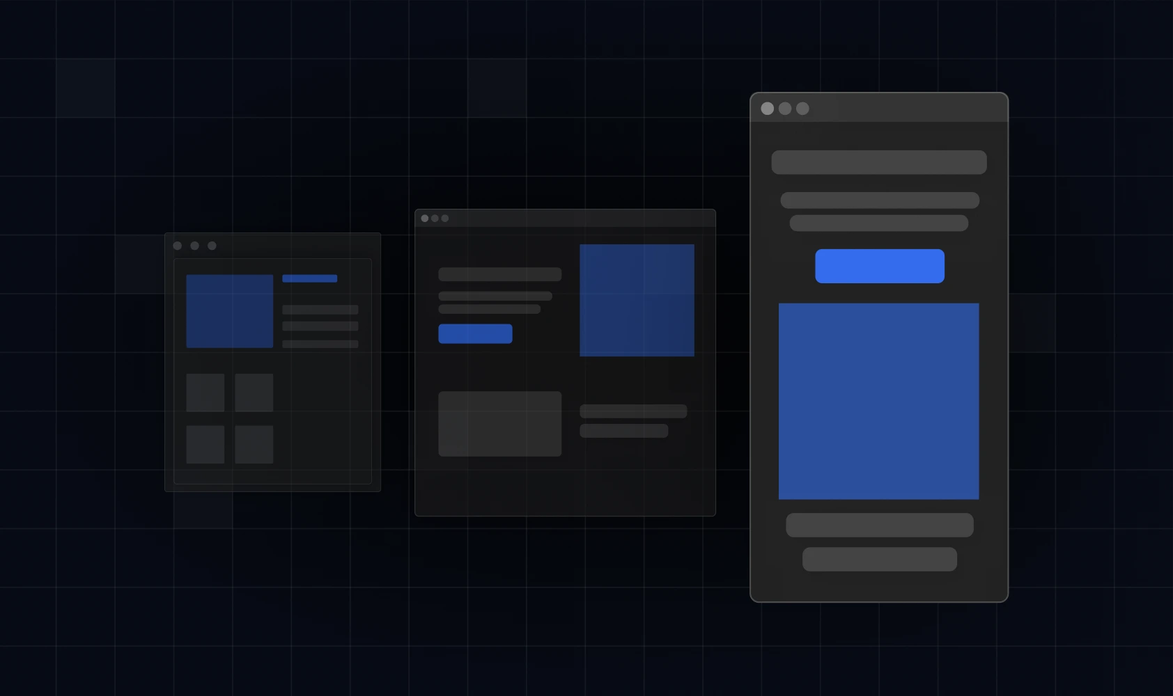
Leverage visual flow and white space
Crowded pages increase cognitive load. Good visual hierarchy, on the other hand, guides the eye without the user even realizing it. White space, contrast, and spacing all nudge attention toward what matters. For example, have you noticed that Apple uses more white space than almost any tech brand? It’s intentional, since it forces focus on the product.
Show proof and build trust
People want validation before they commit. Social proof is how you reduce perceived risk - and it works like magic. Here are some of the best ways to show proof:
- Testimonials
- Case studies
- Logos of trusted clients
- Numbers (“Trusted by 2,000+ teams”)
- G2/Trustpilot badges
Design for speed and simplicity
You can have extraordinary value props and CTAs with a ton of social proof - if the site is slow, nothing else matters. Users leave before the site even loads. That’s why you need to optimize your website by:
- Compressing images and videos,
- Removing heavy scripts,
- Lazy-loading non-essential media,
- Using efficient hosting/CDNs.
Statistics show that a 1-second delay can decrease conversions by up to 7%. It’s one of the reasons we specialize in building result-driven Webflow websites. This platform’s speed and flexibility give us a solid foundation for CRO-focused design.
Prioritize mobile-first design
The chances are that most users will meet your brand on a phone. Therefore, it’s highly important for the mobile experience not to feel clunky. Otherwise, there’s no hope for higher conversions. Here are some of the mobile-first essentials:
- CTAs that are visible without scrolling,
- Buttons large enough for thumbs,
- Text that doesn’t require zooming,
- Forms with autofill enabled.
Does user research help you with conversion design?
For building a converting website, it’s important to understand users’ needs and motivations. One of the best ways to gain this kind of knowledge is through user research. By observing real users and analyzing their behavior, you’ll get insights that can guide you to higher conversions.
Here’s how research informs conversion-focused website solutions:
- Surveys reveal what users actually value,
- Heatmaps allow you to see which areas engage users and where attention drops off,
- User testing highlights elements that prevent conversions,
- Analytics lead to discovering traffic patterns and click-through rates that tell you what actually drives results (and what does not).
Designing without research is like guessing what your audience wants - and hoping for the best. Therefore, make sure not to rely solely on your intuition and assumptions. Involving your users in design decisions is the best practice for eliminating friction and guiding users toward the actions you want them to take.
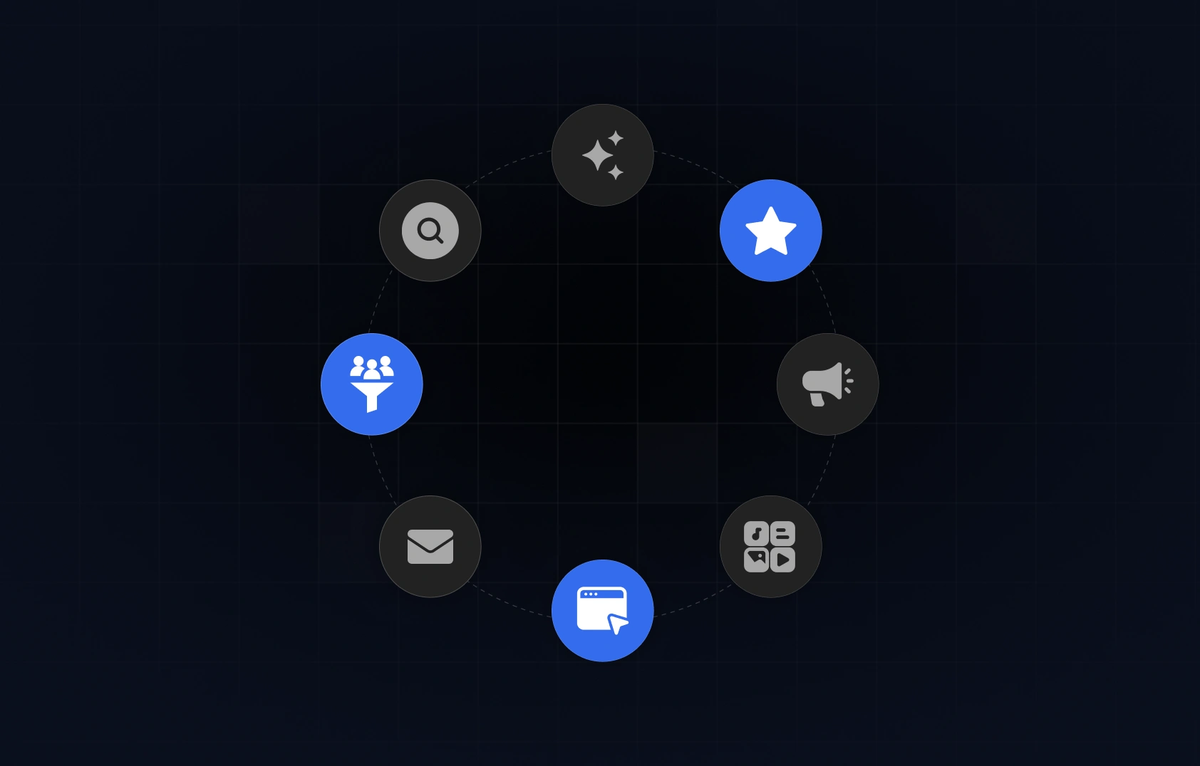
A/B testing platforms to optimize your website
A/B testing is a method of comparing two versions (of a website, in this case) to determine which one performs better. This type of testing lets you experiment with different elements (headlines, layouts, CTAs, and so on) to see what actually works for your users.
Many platforms can help you improve your website through A/B testing, so it may not be simple to determine which one to choose. To help you get a sense of which platform might be the right choice for you, we’ve made a quick guide to the most popular options.
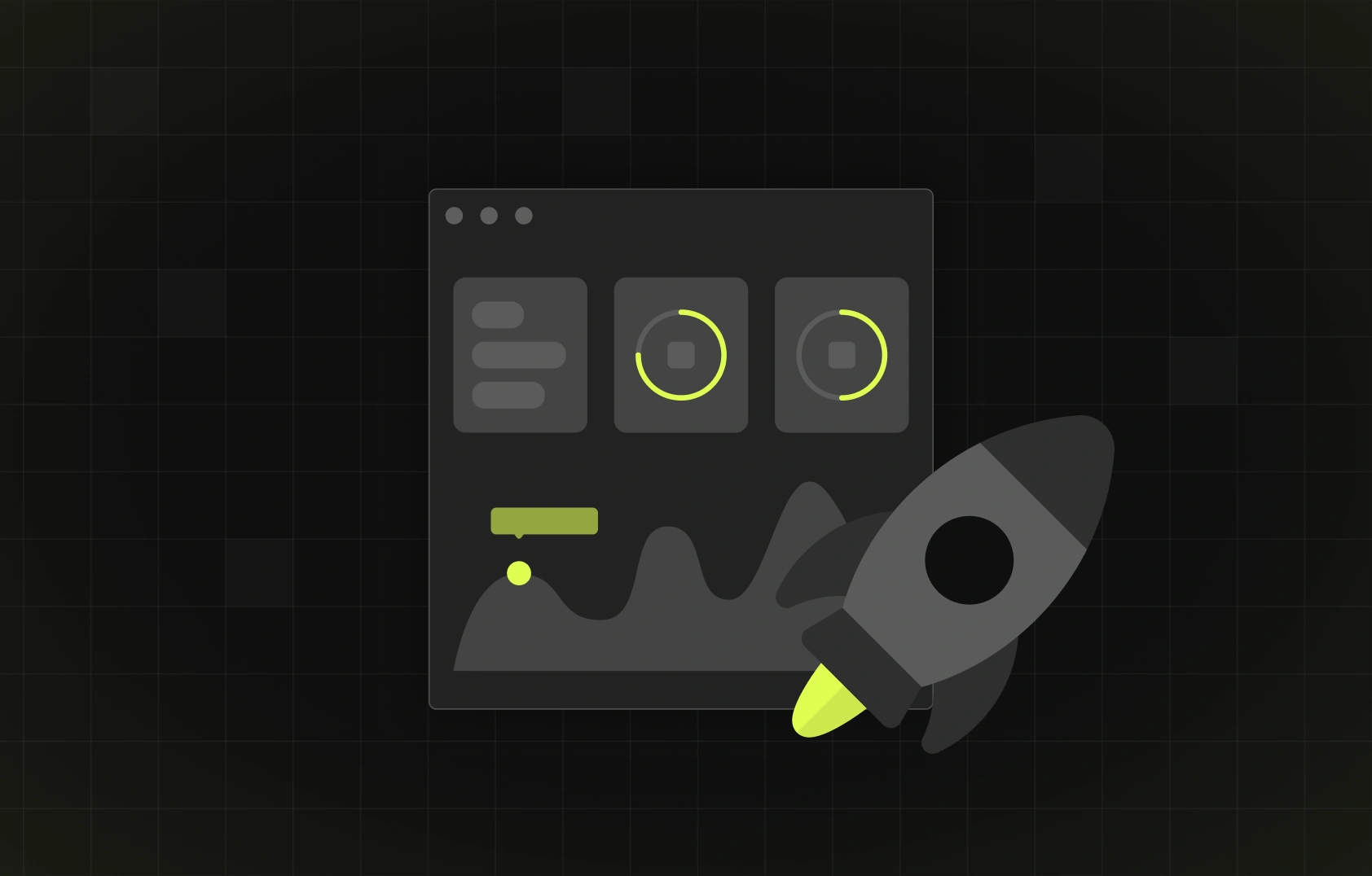
Tracking and measuring success after changes
Conversion rate optimization isn’t a “set and forget” type of process. Once you implement updates, you need to track how they perform. It’s the only way to assess if the changes that were made have a desired effect.
So, which elements should you measure after you’re done with an update? The key ones include:
- Conversion rate by page - shows whether users are completing your key actions.
- Scroll depth and bounce rate - reveal how far people get and where you might be losing them.
- CTA engagement - tells you which buttons attract attention and which need refining.
- Time on page - helps you understand whether visitors are absorbing your content or skimming past it.
- Session recordings or feedback trends - highlights real user friction, confusion, or moments of hesitation.
If your goal is true improvement (as it should be), focus on iterative cycles, not one-time fixes. Make sure to analyze, tweak, and test - over and over. When the right chances are made, small adjustments over time will transform into significant results.

Key takeaways
- Conversion happens when you combine clarity and trust.
- Users act when the next step is obvious.
- Design and data go hand in hand.
- Trust signals (reviews, logos, proof) unlock higher conversions instantly.
- Fast, mobile-friendly pages win.
- User psychology is the backbone of every high-converting experience.
- Research removes guesswork
- Small UX tweaks often outperform big redesigns.
- A/B testing turns assumptions into proven decisions.
- User research prevents guesswork.
Ready to transform your site into a high-converting asset?
Everything in our guide points to one truth - higher conversions don’t happen by accident. They happen when research and psychology meet quality user experience, speed, and immaculate design.
That’s exactly how we approach every project at Devolfs. Our speciality is building websites that not only look great (which they do), but are also engineered for measurable conversion growth. If you’re ready to transform your website into a conversion-focused engine, we’d love to help - so make sure to contact us.


%201.svg)