Table of content
Summary:
In this guide, you’ll learn:
- Why startup website design matters
- What are the core principles that keep your site fast, clear, and scalable
- How to apply these core principles
- How to build a website using practical and up-to-date tactics
- How to avoid the most common startup web design mistakes
- What are some of the best real-world examples of great startup design
Startup web design 101 - lessons for fast-growing brands
When you’re in the midst of developing a product (or a service), forming a trustworthy team, and searching for funding, it’s easy to overlook the importance of your website design. If you add time and budget constraints to that, it’s understandable why building strategically can be set aside. But here’s the thing - more than just looking good, your website plays a crucial role in achieving investor confidence and customer conversion. When done right, web design for startups becomes your pitch deck, landing page, and brand identity - all in one. So, without further ado, let’s break down what makes a startup website truly work.
Why quality web design for startups matters
The first contact with your business and brand will, most likely, be made online. Therefore, unless you want to be perceived as outdated and unprofessional, having a website is a must - but it’s not about having just any site. Based on what they see, visitors and investors will determine their thoughts and further actions. If they see a sharp, well-put-together website, they’ll assume your business operates the same way.
More than just aesthetics, startup web design can become a strategic tool able to power up your business growth. When built expertly, here’s what it can affect:
- Investor perception - a clean and confident website signals credibility.
- User trust - people judge the product by how it looks and feels, and your site sets that first impression.
- Conversion - good user experience keeps people from bouncing and nudges them toward an action you want them to take.
- Scalability - a solid design system makes it easier to grow and update without starting from scratch.
- Hiring & PR - a strong brand experience draws in great talent and gets you noticed.
Core principles of effective website design for startups
Before we dive into specific tactics on designing a startup website, it’s important for you to fully understand the startup web design fundamentals - especially if your goal is to build fast yet smart. Here are principles that can help you hold everything together:
- Clarity over cleverness - if you aim for user-centred design, then people should get your startup in 5 seconds.
- Prioritize speed and simplicity - you can have the coolest motion design, but if your site takes forever to load, users will bail.
- Build for iteration - design layouts and components can be updated in minutes if you set them correctly.
- Focus on storytelling - frame your site so it follows a simple, yet efficient structure: problem, solution, proof.
- Accessibility is credibility - by enabling equal access to your websites, accessibility affects your legitimacy and reach.

Practical tips for designing a website for startups
Now that the fundamentals are covered, let’s get into the part you can put to work right away. These practical tips represent short but tactical steps that help you build a startup website the right way.
Start with positioning and messaging
Before dealing with the visuals, yoy need to think about your story. What do you do? Who is it for? Why should anyone care? Your homepage should answer these questions in seconds - and do it clearly.
Think of Dropbox’s “Everything your business needs to work efficiently, all in one place” message. Through a simple sentence, you get to know it’s a tool for work and that it’s an all-in-one solution. Additionally, it focuses on the benefit users get, not the product itself, which is something you should always aim for.
Build a lightweight design system
Design systems can work wonders when it comes to improved efficiency. This practice allows you to speed up product development and reduce repetitive tasks, all while ensuring brand consistency.
With a well-made design system, you’ll put more time into scaling and innovation, which can be crucial for startup success. Pro tip: Use tokens in Figma or Webflow so everything updates globally when you evolve your brand.
Prioritize conversion paths
Every page must have one job, and it’s for your users to sign up, book a demo, request pricing, download a resource, or the like. Your design should guide users naturally toward where to go next. Therefore, all distractions that compete with the main CTA must be removed.
Design for mobile first
Start from your experience - most of the visits to other websites start from your phone. Therefore, expect your early visitors to scroll on their phones, usually with one hand, often while doing something else. For the design, it means your site has to work effortlessly on mobile.
So, what should you do? Prioritize website usability on mobile as well - fast load times, or, for example, large tap targets are essential in this case. Additionally, make sure your layouts don’t break or overlap across different screen sizes.
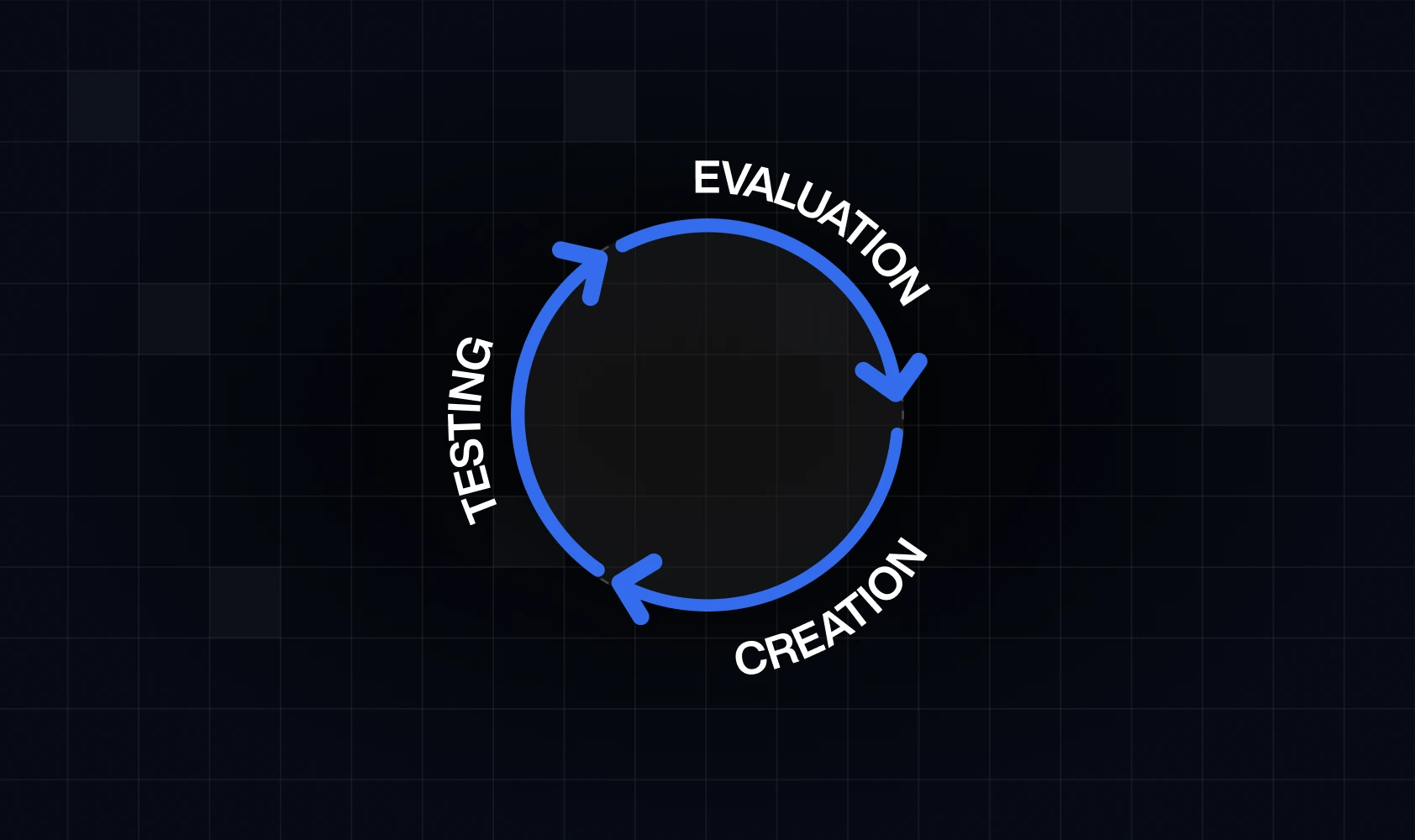
Test and iterate continuously
A startup website needs to evolve at the same pace you do, and any shift your product or service is experiencing, your site should reflect - in real time. You should (regularly):
- Swap out headlines to see what resonates.
- Rework your Hero section when your value prop changes.
- Adjust pricing layouts when you learn what converts.
- Test button copy, CTA placements, and onboarding flows.

Common mistakes startups make in web design
Even with the best intentions, many startups fall into predictable traps when building their website. They’re far from small mistakes on their own and are able to kill clarity, trust, and conversion - inevitably affecting the success of your business. Below we’ve come up with some of the most common mistakes we’ve witnessed, along with their consequences and ways to fix them.
Startup websites for your inspiration
If you’re looking for real-world proof of what an effective website build looks like, we’ve created a list of startup-born companies that grew into global brands. Each of these sites takes a different approach, but they all nail the fundamentals - and here’s how.
#1 Notion
Notion’s homepage is a masterclass in simplicity and product clarity.
- They lead with a crisp value prop that instantly tells you what the tool helps you do.
- The product UI previews are front and center, reducing the need for long explanations.
- Their modular layout gently guides you (basics - features - social proof) without feeling salesy.
#2 Figma
Figma balances friendly branding with enterprise-level credibility.
- Clear messaging speaks to both designers and entire teams.
- Their homepage showcases collaboration as the core product value through visuals, not paragraphs.
- A strong, consistent CTA anchors every section.
#3 Stripe
Stripe is famous for its impeccable design - and for good reason.
- Positioning is clear and ambitious - they tell you exactly what they solve and who it’s for.
- Their use of typography, spacing, and subtle animations makes the site feel premium.
- They pair technical information with human-friendly storytelling.
#4 Slack
Slack’s website feels warm, direct, and unmistakably user-focused.
- Messaging is concise and conversational.
- Illustrations and UI snippets show how the tool fits into your workday.
- They highlight tangible benefits instead of long feature lists.
#5 Webflow
Webflow’s website mixes bold design with an effortless navigation made for all those who wish to build seamless Webflow experiences.
- The visual identity reinforces creativity and capability at the same time.
- Product videos and previews make the learning curve feel less intimidating.
- Smart use of layout and hierarchy directs you toward trying the product.
Web design for a startup - how to scale design as your startup grows
Early on, you can get away with quick fixes. However, as your startup gains traction, small inconsistencies will add up, which will frustrate users and affect your growth. Here’s what you need to do in order to stay fast and efficient, even as you grow:
- Document decisions early - if you don’t document colors or, for example, messaging shift on time, you accumulate design debt, which leads to expensive rework.
- Move from static pages to design systems - a few standalone pages you’ve built should evolve into reusable components, such as consistent buttons, cards, section structures, and typography rules. It’s the only way to keep everything coherent.
- Introduce CMS for easier content scaling - at some point, hard-coding every update becomes impossible. A CMS (such as Webflow or Sanity) lets you create, update, and publish without engineering bottlenecks.
- Create version control for future redesigns - as your brand grows, redesigns become unavoidable. Our advice? Set up proper versioning in Figma or Webflow so you can iterate safely without breaking live pages. It will allow you to experiment and test without any interruptions on your current site.
Key takeaways
- Great design builds traffic, but also trust.
- Start with clarity, then evolve with growth.
- Design systems save you from the potential chaos later.
- Each page should drive toward a clear action.
- Avoid clutter - focus on message and usability.
- Continuous iteration beats one perfect launch.
- Scale smart and evolve without breaking your site.
- Work with a design partner that understands startup pace and ambition
Let’s build a website that will move your startup forward
Building a startup website that actually works takes more than good looks. To achieve the best possible outcomes, you’ll need to combine strategy and clarity with immaculate execution. That’s where we come in. At Devolfs, we help startups create websites that scale with their growth.
We don’t just hand you a design and walk away. We work alongside your team to make sure every detail supports your growth. As a result, you get a website that feels effortless to use and actually gets people to act. If that’s something you’re interested in, all you have to do is contact us - and book your first call.


%201.svg)


