
One website. Every device. That’s responsive web design
From widescreens to mobile, our team helps you create layouts that look and feel just right on any screen - for a seamless user experience.


Stop losing users
on mobile
Over 60% of internet use happens on mobile. If your site isn’t built for it, you’re already losing users - slow load times, clunky layouts, and bad mobile UX drive them away. Responsive web design services can fix that, so you stop missing out and start converting now.
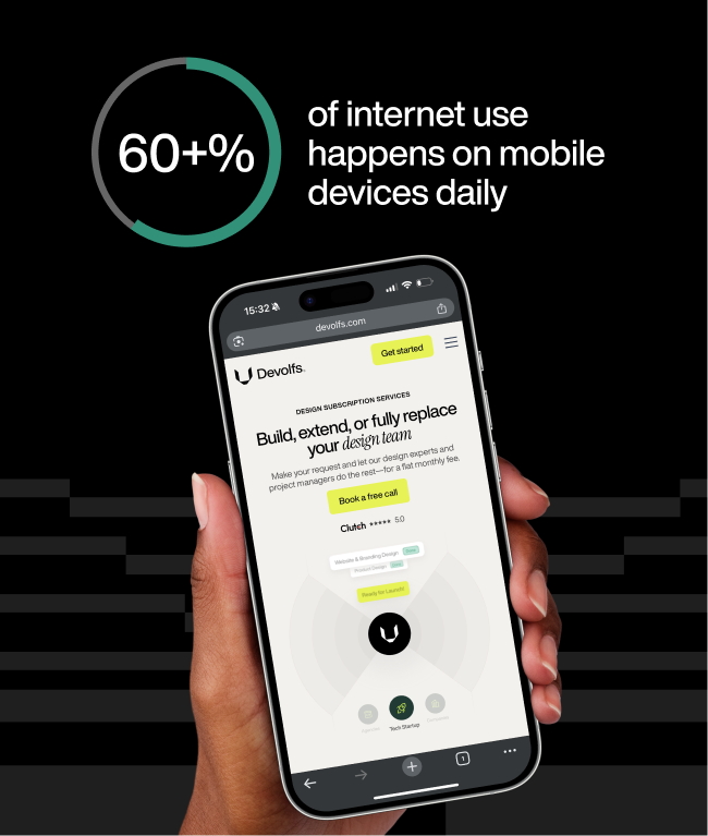

.png)
What does responsive design mean at Devolfs
We focus on what matters, and that’s clear content, smooth navigation, fast load times, and fluid layouts that adapt to any screen. At Devolfs, responsiveness means smart, intentional design, tested on real devices to work wherever your users are.
Built to perform
- and rank
When your site loads fast, people stick around. When it’s built mobile-first, Google notices, and your rankings benefit. And when everything just works, users don’t bounce - they stay and explore. Our responsive design has it all and is here to give you the performance boost you need.

What we offer with every
responsive design project
Layout optimization
Flexible grids
Device testing
Image scaling
Performance tuning
Responsive design fixes
Why teams stick
with Devolfs

Fast response time
We deliver fast, reliable support to keep your site in top shape and quick responses that tackle any issues head-on.

Friendly team
Think of us as an extension of your team. We’re here to offer expert guidance for keeping your site running like clockwork.

Full transparency
We keep our clients updated about every stage of our work. With Devolfs, you’ll know where things stand at all times.

Technical know-how
Due to years of experience under our belt, we can handle everything from minor tweaks to major updates with expertise.

Can you make just the mobile version better?

Will my site look the same on every screen?
What if I already have a developer?
Will responsive design services help my SEO?
Can I use my hours for other services too?
What happens if I don’t use all my hours this month?
Do I get a consistent team?
Can I pause or cancel my subscription if I need to?
What our clients say

Working with Devolfs was a great experience. In just three weeks, they helped us launch a fundraising-ready website that aligned perfectly with our story and goals. Their speed, clarity, and ownership made a real difference for us ahead of our funding round.

Everything was on time and straightforward. Devolfs delivered a high-quality website, and I received my first lead just three days after launch.

Their core strength is digital design and branding. Everything felt thoughtful, cohesive, and well executed, and it clearly helped improve results. The attention to detail and communication were excellent.

What I appreciate most is their attention to detail and how quickly they respond to any feedback.

Devolfs delivered on time, communicated efficiently, and adapted seamlessly. Their process and flexibility ensured a smooth experience.

What impressed me the most during the process was definitely their work ethic and creativity.

The creative approach felt thoughtful and well put together. Everything looked cohesive and on point, and it really helped give the project a strong identity right from the start.

The Devolfs team demonstrated creativity, efficiency, and professionalism while developing our platform.

It was a very good experience to work with Devolfs team! Would do it again with them!

They were true masters of design, bringing creativity and style that far exceeded our expectations.

They were flexible with our requests and were innovative with their design suggestions.

Absolutely great professional work. Highly recommend for any UX UI modern needs.

Devolfs cared about the success of the project as much as we did. Throughout the project they showed as true professionals.

They’re a great partner for design projects, especially for marketing and online platforms.

Devolfs was a key partner for our campaign and helped us design a page in record time.

A young team with outstanding ideas. Our development deadline was pretty short, and they had done everything on time.

They were able to take our vision for an app for women entrepreneurs and turn it into a reality.


