
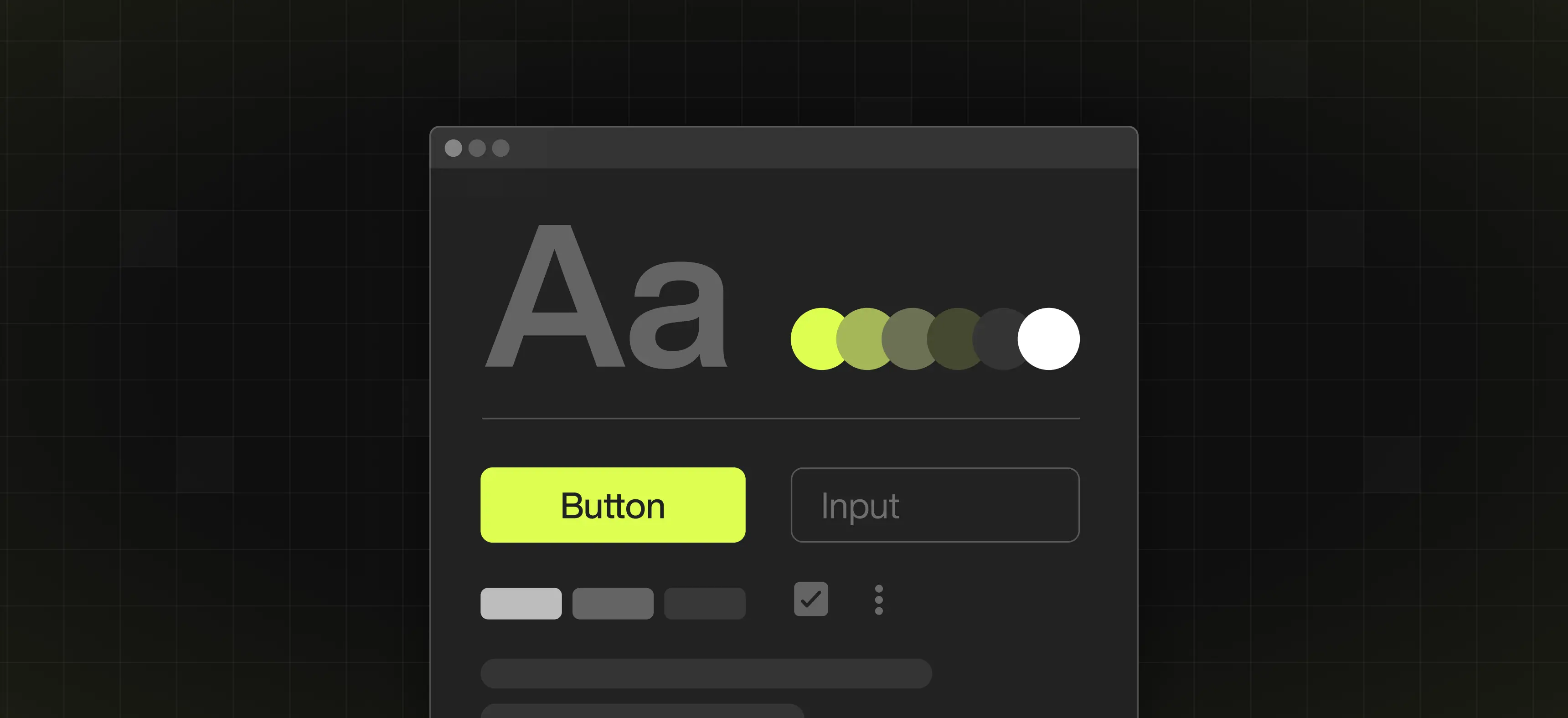
Table of content
Summary:
As teams grow, design chaos can creep in, and it all results in products that feel disjointed. A design system fixes that by creating a collection of components, rules, and standards that keep everything aligned. Here’s what you’ll learn in this guide:
- Why design systems matter
- What are the core building blocks
- What are the biggest benefits of having a design system
- How to create your own design system
- What are some real-world examples of good design systems
- How to avoid common mistakes teams make
- How to build and maintain a design system directly in Webflow
Teams that want to get their break in the market often hit a wall when their design starts to feel messy or repetitive. Luckily, the fix is simple - building a design system. Design systems work by bringing order to the chaos. Big players, such as Airbnb, Shopify, and Webflow, use design systems to keep everything looking and working well, even as they grow.
These systems exist to connect your design, code, and brand so everything feels consistent - and that makes them more than just style guides. We’ve made this comprehensive guide for all those who wish to learn about the design system basics (and then some). It will walk you through everything from what they are to how you can start building your own, so read on.
What is a design system?
A design system is a collection of guidelines, standards, and building blocks that help teams create products that look and work consistently. In some way, they can be seen as the instruction manuals that make sure every part fits together perfectly. When made right, design systems make sure each existing element follows the same style and behavior, as well as brand standards.
It’s a useful tool for designers, but also for developers and marketers. Each of them can and should use design systems as a reference when aiming to keep the product polished and cohesive as it grows.
Here are some of the most essential parts of each design system:
- Design tokens: Colors, spacing, typography, elevation, motion
- Components: Buttons, cards, modals, forms
- Patterns: Navigation, onboarding, error handling, data display
- Guidelines & documentation: Usage rules, accessibility, branding, and best practices
Style guide vs. component library vs. design system - quick comparison
These three terms often get mixed up, but they don’t hold the same meaning. People often use them interchangeably, probably because they are built on each other. It means that you'll probably start with a style guide, then add a component library, and eventually bring it all together into a full design system.
To clarify what exactly each of these terms represents and how they differ, take a look at the table below:
Benefits of having a design system
Without a design system, things get chaotic fast. How? For example, every designer makes buttons a bit differently, while developers recreate the same components. Not to mention, releases slow down because everyone’s fixing small inconsistencies.
A design system changes that. It gives your team a shared set of rules and styles so everything stays aligned. With a well-made design system, you get:
- Speed - you don’t have to design or code the same elements over and over;
- Consistency - every page and product looks and feels the same (even if they are not made by the same person), which is a great foundation for user-centered design;
- Scalability - it’s easy to keep design and code organized, even when your business grows;
- Collaboration - designers and developers all have one source for reference, which makes handoffs much smoother;
- Brand control - your brand’s look stays cohesive everywhere.
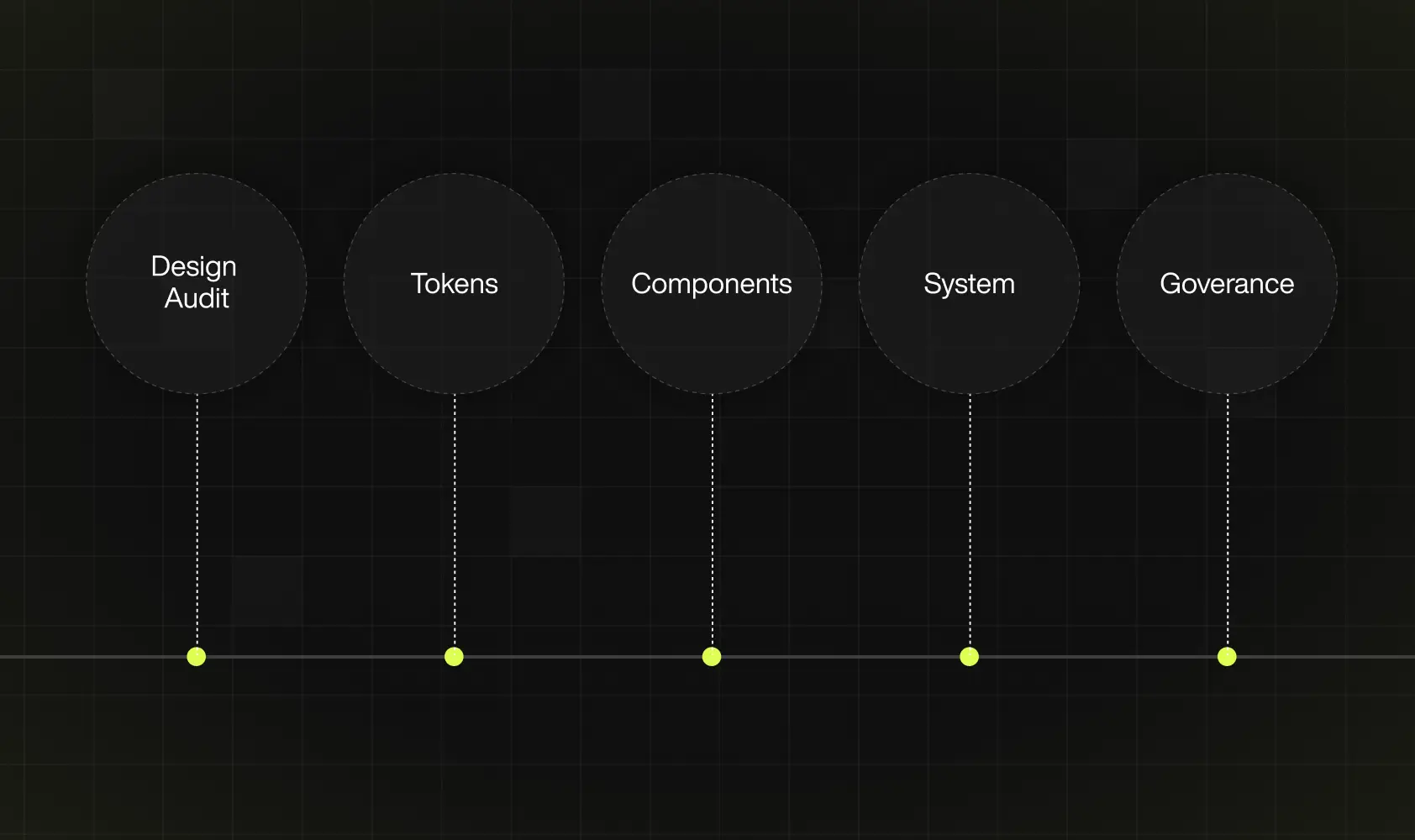
Step-by-step guide - how to create a design system
From figuring out the basics to creating reusable components and clear guidelines, we’ve made a simple and practical walkthrough of building a design system. With its help, you can help your team stay aligned, without the usual headaches.
#1 Audit what you have
The first step should be going through what already exists. It implies gathering all your current design assets, such as screens, Figma files, coded components, color styles, and icons. You’ll likely find similar buttons with slightly different shades of blue or inconsistent font sizes across pages. This step helps you understand what’s working and can be reused and what’s simply broken.
#2 Define core tokens
Core tokens are your basic visual elements, such as:
- Colors,
- Typography,
- Spacing,
- Grids, and
- Icons.
Keep in mind that these elements form the foundation for every component you’ll build later. Why is this important? Because keeping your tokens simple and flexible will make scaling much easier down the line.
#3 Build reusable components
So, now tokens are set. The next step is turning them into actual building blocks - think buttons, forms, cards, modals, and navigation bars. The most important part to remember? Each component should look, feel, and behave consistently, without repetitive work.
#4 Document everything
In order for a design system to work, it needs to be well-documented. Therefore, make sure to write clear guidelines on how and when to use each component. It’s the best way to be certain everyone stays on the same page.
#5 Set up a governance model
It’s important to define how well the process of proposing changes goes, as well as who maintains the system, reviews updates, and approves new additions. Make sure everyone in your team knows how updates happen.
#6 Test, iterate, and educate
Once your system is in place, don’t launch your entire design system across every project immediately. It is a far better decision to start small (like with one product or feature). Why? It provides you with the possibility to test how it works and fix any issues (if they occur). Launching the entire design system can backfire fast.
In addition to that, to keep everyone in the loop, it’s a good practice to hold short workshops or demos. While it may sound exhausting for both you and your team, it’s the best way to help everyone understand how to use the design system effectively.
Examples of successful design systems
More than being just “nice-to-have” extras, design systems can actually make a real difference. As we mentioned, they are able to save time and reduce mistakes - when done right. Many companies have opened up their design systems for everyone to explore. It’s a great practice, since you can see exactly how they organize components and document rules.
Therefore, you can quickly start learning from what’s already working and borrowing proven ideas. So we don’t just stick to the theoretical side of things, let’s see some of the real-world examples of great design systems:
- TapTap Design System
TapTap’s system is built for speed. You can put together clean, consistent screens fast, and everything works in dark mode out of the box. It even includes ready-to-go layouts that save you hours of setup.
- Google Material Design 3
Material Design 3 gives you a solid structure to build on. Colors, typography, and motion all follow clear rules, so your designs instantly feel balanced and familiar to users.
- Arco Design System
Arco keeps things simple through reusable pieces and straightforward documentation. It’s perfect for custom web solutions where you just want things to look right and behave as they should.
- Shopify Polaris
Polaris does what every good design system should - keeps everything consistent. It helps Shopify (and thousands of apps built on it) stay on-brand and accessible without endless back-and-forth between teams.
Common challenges and how to avoid them
It may not seem like it from afar, but even the best teams hit a few bumps when creating a design system. After helping multiple teams, we’ve noticed the same issues pop up again and again. The good news is that most of these mistakes are easy to avoid - but only if you know where to look. Luckily for you, we’re here to help. Based on our experience, here’s what we usually see go wrong and what you should do to avoid it:
- Overengineering the system - always remember that you don’t need to build a “perfect” system right away. It’s always better to start small and test, and only then add more as you go.
- Low adoption - if the team doesn’t use it, it doesn’t matter how good it looks. That’s why you should keep docs easy to find and run short demos.
- No clear owner - someone has to keep the system clean and up to date, otherwise it turns into chaos fast. The best tip we can give you to avoid this is to pick maintainers early.
- Outdated docs - the worst thing is not a non-existent design system, but a stale one. Review everything regularly, like any other live product.
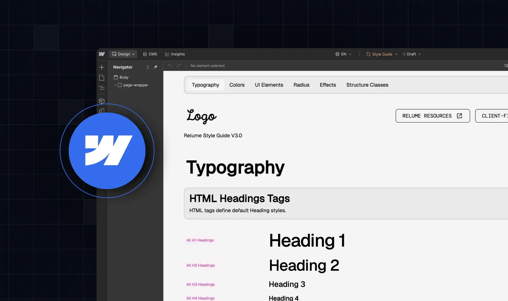
Webflow design system features
As a no-code website builder packed with built-in features, Webflow makes it surprisingly easy to build and maintain a design system. You don’t need to use multiple tools or write a single line of code, since everything from components to color tokens is located in one platform. It’s all highly visual, flexible, and, most importantly, simple enough for both designers and marketers to use.
Here’s how its main features make building a design system easier:
- Reusable components - you can turn any element into a reusable symbol or component. The reason it’s so great? You can update it once, and the change will appear everywhere (it’s perfect for buttons or, for instance, navigation bars)
- Style guide pages- this platform allows you to set up a single style guide page, the one that defines your colors, typography, and spacing. Once done, you can apply and update these styles globally, so you always stay consistent.
- Variables for Tokens - Webflow’s Variables feature lets you create reusable tokens for colors, font sizes, and spacing values. Changing one variable updates every place it’s used.
- CMS-Driven Design - with the Webflow CMS, you don’t have to manually update text or images each time. You can add or edit content in the CMS, and it automatically updates everywhere that component is used.
- Class-based styling - once you define a class for, say, “Primary Button,” every button using it follows the same rules.
How to set up a design system in Webflow
To make things easier, we’ve broken it down into a quick mini-guide you can follow, even if you’ve never built a design system before. Here’s what you need to do
- Create a style guide page
Start by defining your colors, fonts, and spacing on a dedicated page. This page will work as a single reference point for your team - and ensure a consistent design.
- Build global components
Turn repeated elements like buttons and navigation bars into Symbols. It will save you much time. How? If you decide to update one, it updates everywhere.
- Use variables for tokens
Set up Variables for colors, spacing, and typography. This will keep your design consistent across all pages and components.
- Connect to CMS collections
If you need dynamic or repeatable content (like blog posts, team profiles, or product listings), link components to CMS Collections so updates happen automatically. Great, right?
- Keep the documentation section
Document changes and rules in one accessible place. This keeps your system organized and, more importantly, ensures the team knows what’s current.
Expert tips from Webflow specialists
As Webflow experts, we have built a lot of design systems with this platform - and not just for ourselves. After helping different teams organize their chaos, we’ve learned a few things that make all the difference. Here are some of our favorite tips for keeping your Webflow setup stress-free:
- Name things like you’ll scale - don’t wait until you have 50 components to start naming properly. Use a consistent naming system from the start (something simple like btn/primary, card/feature, or nav/main). It’ll save you hours later.
- Use combo classes wisely - if you plan on stacking combo classes, do so only when they truly serve a purpose, to avoid unnecessary mess.
- Set a base style before anything else - before building fancy layouts, define global tag styles (meaning headings, paragraphs, links, buttons, etc.). It’s the easiest way to create consistency without even touching classes.
- Build for reuse - when you create a new component, think: “Will I use this again?” If not, simplify it or merge it with an existing one. Don’t let your system become a stack of unused elements.
- Use Webflow’s Style Guide as your testing ground - yes, you can use it to store tokens and colors. However, it’s an excellent place to preview and test components together. It helps you spot spacing issues or inconsistent interactions early.
- Document right in Webflow - you don’t need a separate Notion page. Add quick notes or sections directly in your style guide page.
Key Takeaways
- Don’t try to build the “perfect” system right away.
- Start small. Once that works, keep adding.
- Clean up first what you already have.
- Get your basics straight. If those are solid, everything you build later will feel consistent.
- Write things down as you go.
- Pick someone to be in charge of the system.
- Test it with one project first.
- Keep improving it.
- Use Webflow to make your life easier.
- Name things properly.
- Build with reuse in mind.


%201.svg)


