
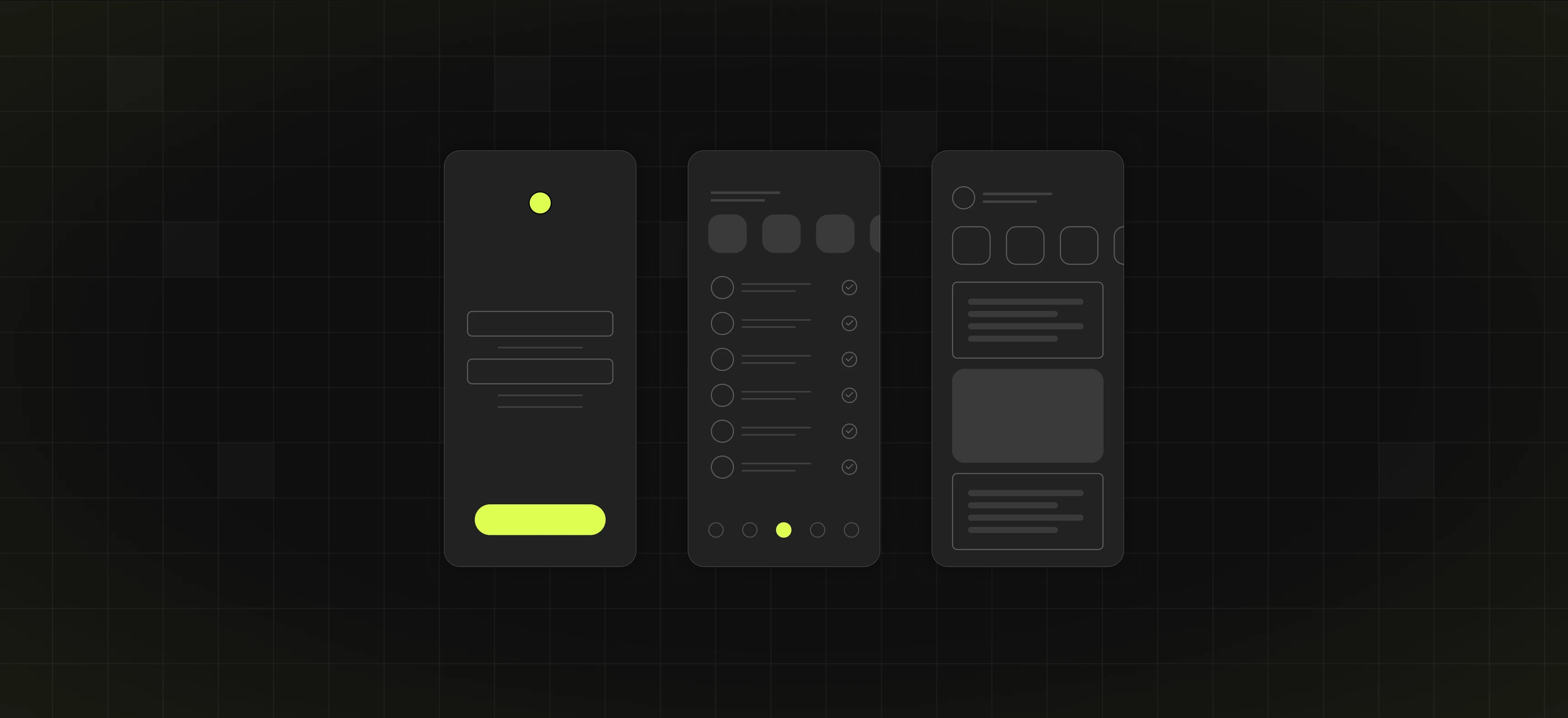
Table of content
Summary:
Designing great mobile UX implies thinking of how people interact with your product on the go. Here are some of the key takeaways we’ll discuss further in this article:
- Mobile UX is critical to user retention, engagement, and overall business success.
- It’s better to aim for simplicity, speed, and clarity than complexity.
- Small design details (like tap size or scroll behavior) have a big impact.
- Mobile-first thinking leads to better products across all screen sizes.
- The right tools (Figma, Hotjar, Maze) make the process easier and faster.
You’ll also be able to see real-world examples (Spotify, Duolingo, Asana) which show how intuitive mobile UX design keeps users coming back.
Mobile UX design - why it’s more than just a smaller screen
Be honest with yourself - how much do you really use your mobile phone? Studies show that average usage today is around 6.5 hours per day. Therefore, it shouldn’t come as a surprise that businesses all around the world have started prioritizing mobile UX design to get a competitive advantage. Mobile UX design is focused on when and how people interact with a product on smaller screens. Therefore, it implies much more than shrinking desktop content. If you’re curious to learn all about mobile UX design and its importance for your business, read on.
What Is mobile UX design, really?
Mobile UX design is a process of building user-centric mobile app and website experiences with the goal of creating smooth and meaningful interactions. Meeting user needs and expectations is the main objective of each mobile UX design project, as a way of achieving a satisfactory user experience. While the name suggests it’s meant for smartphones, it also encompasses other device types, such as tablets and watches.
Mobile UX/UI solutions focus on usability, speed, and touch-first interaction, all of which are essential when users are navigating your product with one hand, often on the move. When done right, it can significantly affect user retention and engagement. Simply put, it can help you ensure people not only use your app but also keep coming back to it.
What is app UX design - and is it the same as mobile UX design?
App and mobile UX design are terms often used interchangeably, but they don’t always mean the same. App UX design is a part of desktop or mobile product design with the goal of creating apps that are intuitive, easy to use, and enjoyable.
The term mobile UX design, however, is broader - it includes mobile websites, web apps, and native apps. Mobile UX focuses on optimizing any experience for smaller screens. App UX, on the other hand, is all about crafting the user journey inside a standalone app.
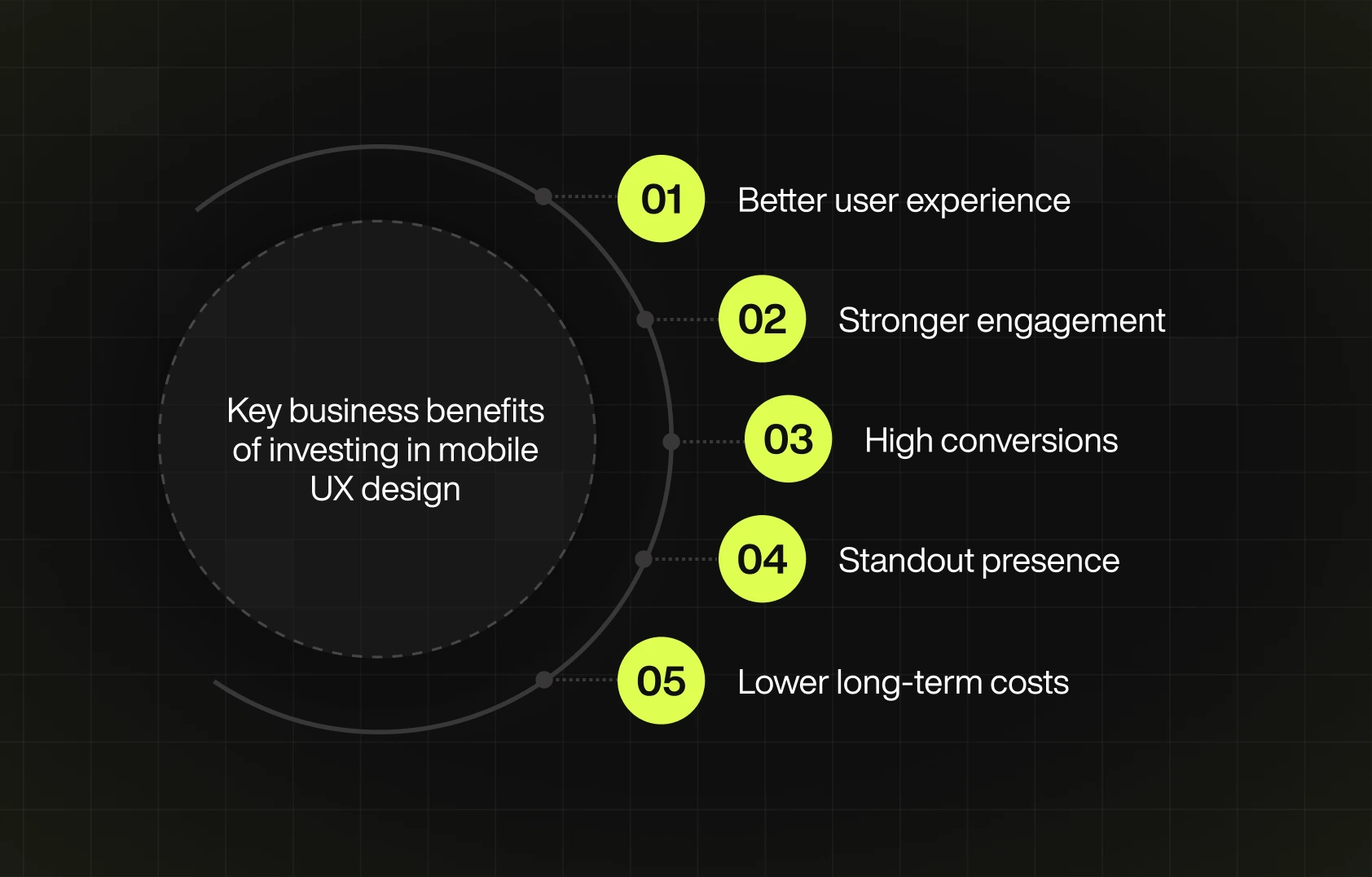
Why is mobile UX design important for your business?
Why is UX design crucial to my mobile app's success, you ask? No matter the business you’re in, the chances are you have a lot of competition, and one of your main goals is outperforming them. Studies show many UX/UI benefits that are able to make a difference. For example, did you know that 74% of users are more likely to come back to a site that gets it right? Therefore, for you to build a solid customer base that keeps coming back to your product/service, you need to provide an exceptional user experience.
The key principles of great mobile UX
People don’t use their phones the same way they use a laptop - it’s a simple fact. While on the phone, you’re tapping with your thumbs, multitasking, walking, or in line. Therefore, mobile UX design needs to feel effortless, not add confusion. As Alan Cooper, a well-known expert in user experience and software design, would say:
“If we want users to like our software, we should design it to behave like a likeable person: respectful, generous, and helpful.”
Several principles can make that happen, and the most important ones are:
Simplicity
On mobile, less is more. Every screen should focus on a single task or decision. Designers need to avoid overwhelming users with too much information or too many actions at once. They should focus on the essentials and guide users with clear layouts. If something isn’t necessary, it probably shouldn’t be there.
Touch-friendly interfaces
Taping on a smartphone can be, and often is, imprecise, and good UI/UX design needs to account for that. Buttons, icons, and interactive elements should be large enough and spaced out to avoid accidental taps. Gestures, like swiping, tapping, or dragging, should also be simple and intuitive.
Accessibility
Mobile app or website accessibility refers to the practice of considering all types of users and their potential impairments in order to create a product that’s easily understandable and operable. More than just a suggestion, accessibility is an internationally recognized standard, according to the official Web Content Accessibility Guidelines (WCAG). Avoiding visual effects that can cause seizures, making a distinction between background and foreground colors, and providing captions for images are just some of the examples of how to design according to it.
Intuitive navigation
Users shouldn’t have to guess how to move around. That’s why it’s a good idea to stick to familiar patterns like bottom navigation bars or hamburger menus (like many of the mobile apps/websites you already know do). Good navigation is not something the users will consciously notice. However, it can boost engagement by helping people get where they want to go, without making them think too hard.
Consistency
Visual and functional consistency builds trust. The same color palette, typography, and interaction patterns throughout the app add to your credibility and reliability. On top of that, keep in mind that when things behave the way users expect, they feel more confident and in control. Therefore, reinventing common features (like navigation bars or icons) just for the sake of it is not advisable.
Fast load times
Users expect mobile apps to respond instantly. Long load times or, for example, unresponsive interfaces lead to drop-offs. Studies show that 53% mobile users opt to abandon a website that takes more than three seconds to load. Therefore, there’s no denying that good speed and smooth performance are part of good mobile UX design.
Common mobile UX mistakes (and how to avoid them)
With all that needs to be done in the rush to get things live, it’s easy to overlook the little details that end up making a big difference. Here are some of the most common mobile UX mistakes we’ve seen so far - and what you can do to fix them:
- Too small tap targets - all interactive elements (like buttons or icons) should be big enough and have enough space around them to avoid accidental taps.
- Too much content - mobile screens aren’t made for dense blocks of text or cluttered layouts, so you need to prioritize your content. Shorter copy and clear headings are a good start.
- Hidden or confusing navigation - If users can’t find their way around your app or site, they’ll likely give up. Therefore, it’s best to stick to familiar patterns, as we described above.
- Full screen of pop-ups - subtle, timed prompts (like banners or slide-ins) are a much better choice, since they don’t disrupt the flow.
- Slow load times - we already mentioned that if your site or app is slow, people will leave. The best way to improve your speed is to optimize images, clean up your code, and test your speed regularly.
- Long forms - nobody likes excessive typing on the phone, so make sure to ask only for what’s necessary. At the same time, use autofill, dropdowns, or toggles wherever possible. If the form is long, make sure to break it into step-by-step screens.
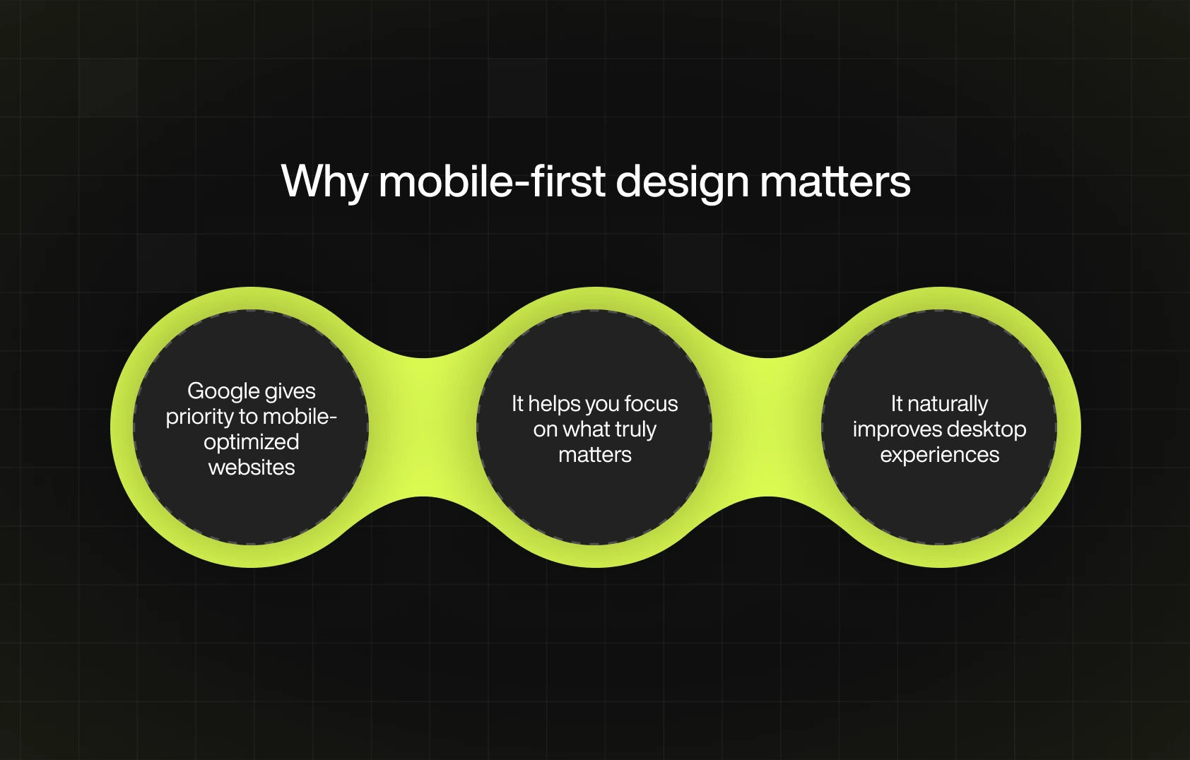
How to design with mobile-first thinking
Mobile-first design means starting your design process with the smallest screen in mind. Since mobile screens offer limited space, this approach forces you to focus on what truly matters, such as the core content, intuitive navigation, and essential features. Starting with a desktop and then working down often leads to bad mobile experiences. What looks good on a big screen may seem awful when squeezed onto a phone.
On the other hand, by stripping away anything unnecessary from the start, it’s possible to create a cleaner experience that works well across all devices. Simply put - it’s much easier to scale up than to scale down.
So, how to design with mobile-first thinking? Here are some of the most important rules:
- Prioritize the essential content and actions
- Keep your layouts simple and touch-friendly,
- Ensure fast loading speed,
- Use a clear hierarchy with minimal distractions.
Once the core experience works well on mobile, you can gradually enhance it for larger screens by adding more visuals, features, or layout complexity.
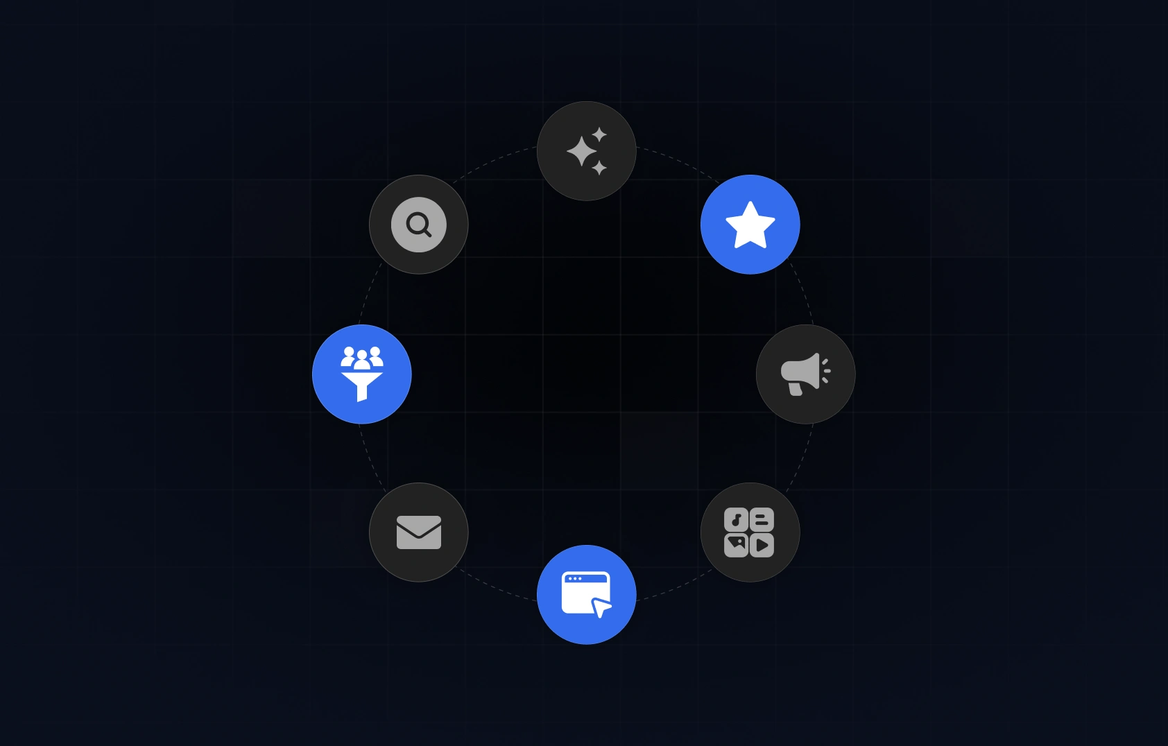
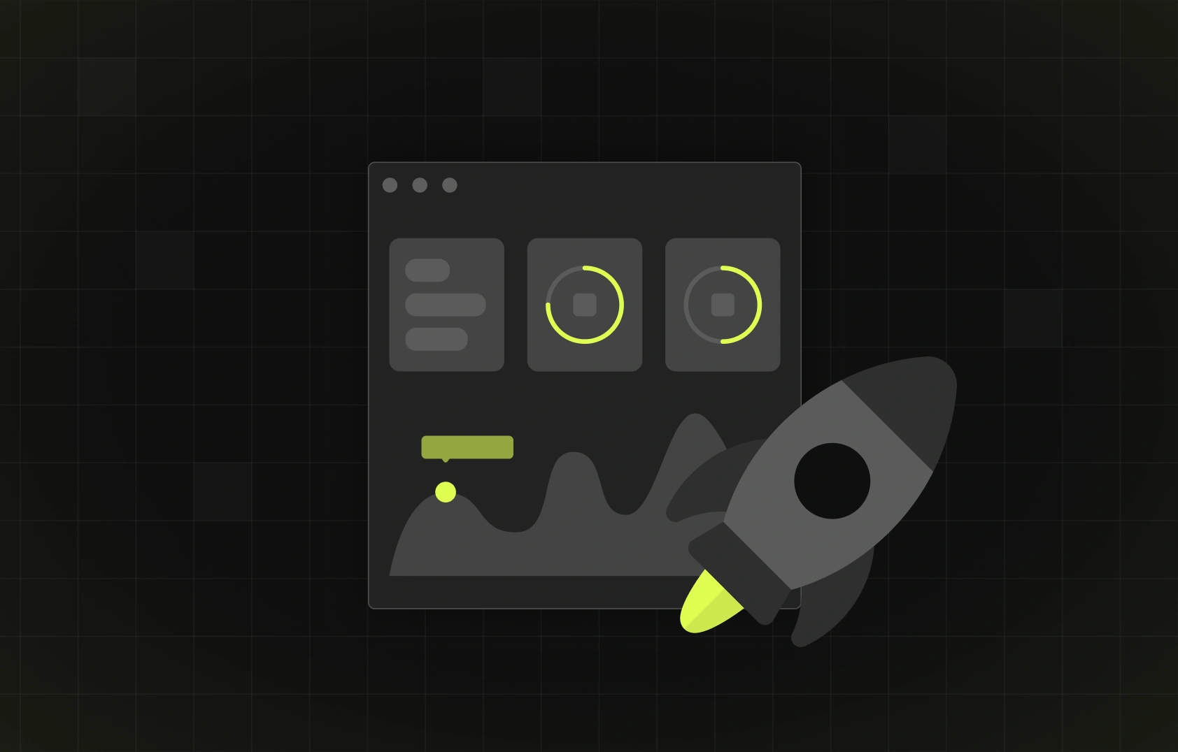
Tools that make mobile UX easier
A large part of mobile app/website success lies in the user experience it is able to provide. Luckily, there are many UX design tools to choose from. When used right, they can create a significant advantage when it comes to products' appeal and ease of use. From streamlining the design process to analysing and testing, here are the tools favored by many mobile UX design teams:
Real examples of effective mobile UX
We’ve covered the theory behind mobile UX, but what does it look like in practice? Let’s check out a few apps getting it so right, there’s a good chance you already have them on your phone:
- Spotify
Spotify delivers a seamless mobile experience, but did you ever stop and wonder how it manages to do so? The answer is simple - by prioritizing personalization, speed, and ease of use. It’s amazing how the offered content feels tailored to your tastes and how you can switch effortlessly between music, podcasts, and their library (due to simple tab-based navigation). Clean layouts and smart use of space also make the experience feel natural.
- Duolingo
This language learning app gets mobile UX right with simple learning steps, as well as short lessons and fun, game-like features. The app’s playful design also helps. If you’ve used it so far, then you can certainly remember streaks and badges, and how motivated they made you to continue learning (and using the app). What you may not have noticed is how the interface is fast and uncluttered, but it must have made it easy to run the app and complete a quick lesson.
- Asana
Asana makes mobile project management feel surprisingly easy. Whether you're checking off a task, assigning work, or reviewing deadlines, Asana’s simple layout and controls make it easy to manage tasks. It’s proof that productivity tools can be just as effective on mobile as they are on desktop.


%201.svg)


